
UCL
How might we help researchers find and compare relevant information, fast?

INTRODUCTION
CLIENT: The University College London. UCL is rated as one of the top ten universities in the UK.
CONTEXT: UCL is on a mission to improve the fragmented research sector. The UCL team is developing technology that can draw resources from multiple locations into a central research platform, named Harmony.
OUR GOAL: Design the new search and discovery area for Harmony.
TIME FRAME: Two-week sprint.
TEAM: I worked closely with two other team members to carry out the research phase, before we each split to develop and deliver three unique designs for the client.

-
Competitor analysis
-
User interviews
-
Affinity mapping
-
Persona creation
-
Empathy and experience maps
-
User stories and fows
-
Information architecture
-
Wireframes
-
Prototyping
-
Usability testing

PROJECT OVERVIEW
Snippet of client feedback:
"Sophie took on a complex UX problem (...) and demonstrated a deep understanding of the challenges faced by our users. Her designs felt simple and intuitive but were rich in well-thought-out detail." (See full review below)
KICK OFF
Listening to our stakeholder
We met with 3 UCL stakeholders to gain insight on the current problem, understand the business goals, and take note of any constraints.
From our meeting, we came away with clear project goals:
ORIENTATION
What else is out there?
Desktop research
Through desktop research, I gained a deeper understanding of the problem described by our client.
I was shocked to discover just how many research catalogs and databases existed...

Similar site analysis
To understand the market landscape I critically analysed the following sites, asking myself:
-
What is done well?
-
What is unintuitive?
-
Is there anything in common?
RESEARCH
Getting to know our audience
Screener survey
A screener survey was crafted to locate suitable audience members to interview in more depth. I was looking for individuals either currently completing academic research or who had completed research in the last year.
Responses: 126
Key insights from the survey included:
Of users use multiple research platforms
Say the research process is extremely lengthy
Use Google Scholar as their main research platform
Are passionate about their research area
1:1 interviews
I crafted interview questions to uncover valuable insights from potential users, based on 3 core research goals:
-
Understand a day in the life of a researcher
-
Assess users’ current workflow/process
-
Identify users’ wants and needs when searching for resources
I really enjoyed using my empathy and active listening skills to put participants at ease, encourage open conversation, and dig deeper to discover valuable insights.
KEY LEARNING: Don't fill the silence!
"The research process relies too much on figuring out what 's relevant and what isn't"
User interview quote, PHD Student
SYNTHESISE
Finding a story in the data
Affinity mapping
We extracted over 300 data points from our user interviews, and together we worked as a team to create an affinity map by grouping related ideas, themes and insights.
This process allowed us to:
-
Uncover patterns
-
Prioritise user needs
-
Identify key pain points

Photo: Affinity mapping. I love this part of the process - it feels like a satisfying puzzle and my big-picture thinking style means I can quickly connect the dots and see themes emerging.
Key user insights
From the affinity map, key user insights were revealed, including:

Academics are confused and frustrated by the current research process

Spend too much time trying to decipher which search results are most relevant

Concerned about credibility - value quick access to citations
EMPATHISE
Bringing our user to life
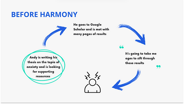
Meet Andy, the busy academic researcher
To focus the design process on the user's needs, behaviours, and goals, I created a persona:

Stepping into Andy's shoes
I created an empathy map to better understand the user's thoughts, feelings, and motivations, ensuring a more user-centered approach to the design process:

DESIGN CHALLENGE
So, how might we help Andy?
Distilling the problem
Problem: Busy academic researchers need an efficient way to find research materials, because they want to reduce the amount of time they spend on the research process.
How might we make the research process more efficient?
Problem: Busy academic researchers need a way to determine which of the many search results are most relevant, because they want to produce high-quality work that adds value to their field.
How might we help Andy determine which search results are most relevant?
IDEATE
To the drawing board
Idea 1
Summary: A centralised search platform, using traditional key word filtering and displaying resources in the traditional card layout.
Pro: Users will feel familiar with the traditional filtering method and card layout.
Con: Traditional key word filtering is restrictive and card layouts make it difficult to quickly compare between results to determine the most relevant.


Idea 2
Summary: A centralised search page that offers both a traditional filter search option, and a dynamic AI search bar.
Pro: For users unfamiliar with “ChatGPT-like” prompts, there is a traditional filtering search option.
Con: Choice would add high mental load and friction at the very first step.
Idea 3
Summary: A simple, Google-like interface with a dynamic search bar allowing ChatGPT-like prompts. Results are displayed in a grid like format rather than the traditional card layout.
Pro: Dynamic prompts allow the user to have more control over the filtering process. Displaying results in a grid allows for easier comparison.
Con: Users stated in the interviews that they did not fully trust AI - sources would need to be clearly displayed.

Why I chose to pursue idea 3
Idea 3 meets both the user and business goals as it:
DEVELOP
Working through complexity
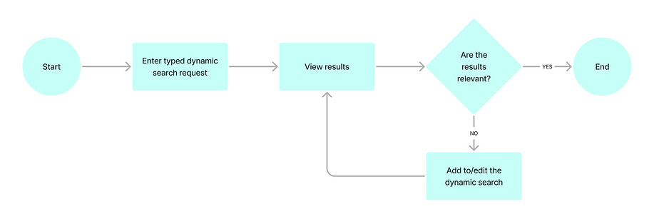
User stories and flows
I created user stories and user flows to visualise the user's journey and ensure the design aligned with their goals and expectations.
User story: "As a busy academic researcher, I would like to search and view relevant results so that I do not waste time looking at irrelevant results"
User flow:
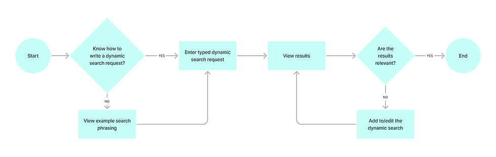
Iteration - not all users know how to write dynamic prompts
Through early-stage testing, I noticed that while most users were familiar with how to write dynamic, Chat GPT-like search prompts, other users were unsure.
I therefore added an option to view example searches, and updated the user flow:
Wireframes
Starting on paper allowed me to explore ideas and iterate on layouts quickly before moving to digital design tools.
Wireframe sketch V1

I tested different locations to display the search bar and the record of search requests, making design decisions based on usability testing feedback.
Wireframe sketch V2

PROTOTYPE & TEST
Create, listen, iterate...
Usability testing
I created a prototype and conducted usability testing in order to:
-
Sense-check design decisions
-
Uncover points of friction
-
Ensure an intuitive, efficient and satisfying experience
Testing revealed more changes to implement:
Grey side bar became collapsable to minimise screen clutter
Search bar moved to top, after being missed hovering at the bottom of the screen

Template column suggestions were added, to guide the user through the modern, AI assisted search process.
PRESENT
Final design
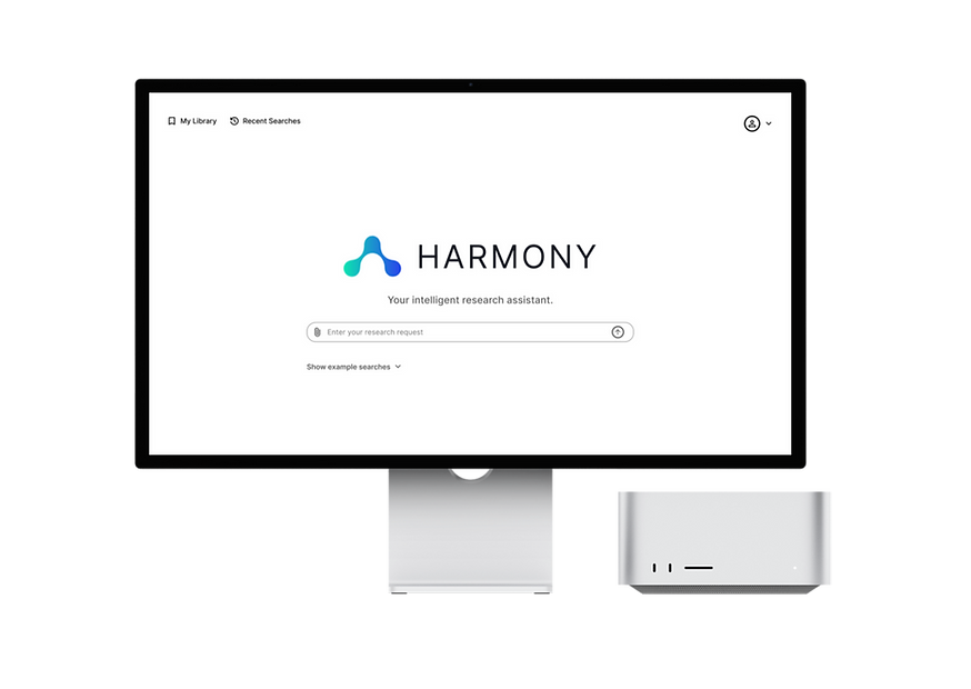
Landing page
-
A clean, familiar-looking search bar allowing dynamic Chat GPT-like prompt.

Results page
-
Results are displayed in a grid format to allow rapid comparison to find the most relevant results.
-
It is possible to further determine which results are most relevant by adding a column to extract specific information, e.g. 'Methodology'.

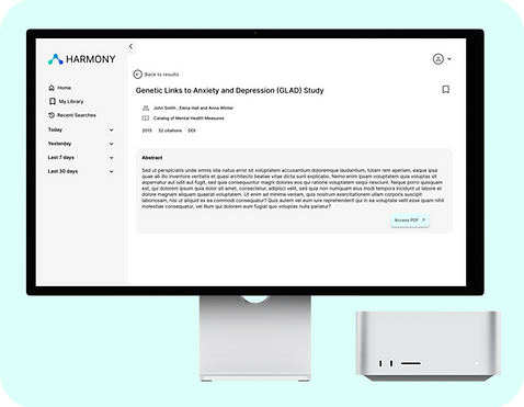
Individual resource page
-
A summary of the abstract is provided, with a direct link to the full resource, which sits on one of the external metadata platforms.
PRESENT
Communicating design decisions
UX storytelling is essential for stakeholder buy-in as it effectively communicates the user's journey, making their needs and challenges relatable and inspiring alignment around the design vision.
I created presentation slides that simply portrayed product value for the user:

IMPACT
What would success look like?
Measuring success
I identified 3 key KPIs to prioritise if Harmony were developed:


RESULT
Client feedback

KEY LEARNING
Listen to the user, and test!
This project reinforced the importance of active listening in creating meaningful user connections and effective user experiences.
Throughout the design process, I prioritised gathering user feedback through interviews and usability testing to determine design direction and decisions, and, as a result, the UCL team were pleased to receive a user-centric design solution that met both user needs and business objectives.